S&P 500 Heatmap Explained: How to Read the US Market Map
Each box is a company, its size is the company's market value and its color is the day's move. A handful of boxes cover a third of the picture, so read the sizes and sectors before the colors. A walk through the October 23, 2026 map.
The US map on Pacific Tape draws every stock in the S&P 500 as a box. The size of a box is the company’s market value in US dollars. The color is how much its share price moved. Green means up, red means down and gray means unchanged. Buttons above the map switch it to the Nasdaq-100 or the Dow 30.
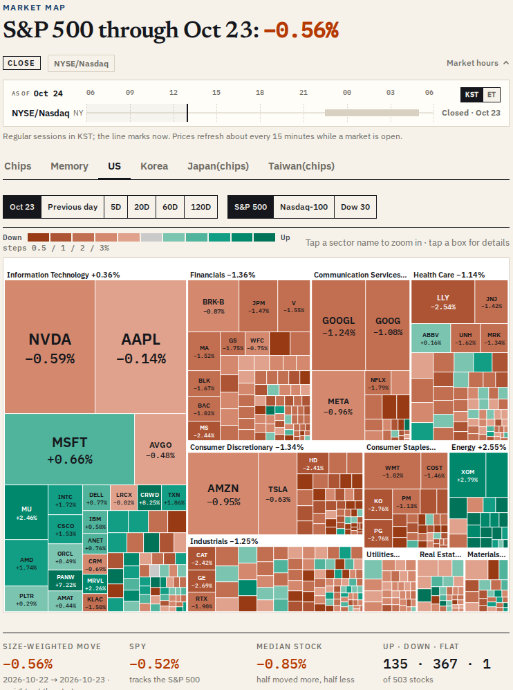
Read the sizes first, then the sectors, then the colors. On October 23, 2026, the boxes added up to about US$69.59 trillion, and five companies covered more than a quarter of the picture. The examples below all come from that day’s US regular session.
Which stocks are on the US map?
The S&P 500 view holds the index’s members: 503 lines on October 23, because Alphabet’s class A and class C shares are separate boxes. The member lists follow the published index lists. The Nasdaq-100 view holds 101 lines, 15 of them companies outside the S&P 500. The Dow 30 view holds the 30 Dow stocks, all of which are also in the S&P 500.
A stock that joined the market recently can show “n/a” for a period that began before it listed, and one company without a share count in its SEC filings yet has no box, though it still counts in the up and down tallies. How a Stock Gets Into the S&P 500 and the Nasdaq-100 explains how the lists change.
What do the box sizes mean?
A box’s area is the company’s market value: its shares outstanding from its latest SEC filing times its closing price. The share count is the full count, not adjusted for free float, so a company’s share of the map is close to, but not the same as, its weight in the index.
On October 23:
| Company | Share of the map |
|---|---|
| Nvidia (NVDA) | 7.31% |
| Apple (AAPL) | 7.29% |
| Microsoft (MSFT) | 5.60% |
| Amazon (AMZN) | 3.84% |
| Alphabet class A (GOOGL) | 3.08% |
Those five covered 27.1% of the map, and the ten largest boxes 38.0%. Unlike the Chips map, the US map has no box-size or grouping menu: boxes are always sized by market value and grouped by sector, and they are labeled with tickers.
What do the colors mean?
The color is the move over the period you pick: the latest session, Previous day, or 5D, 20D, 60D and 120D, counted in trading days. The shades step up as the move grows, and the steps widen for longer periods:
| Period | Color steps (each side) |
|---|---|
| One day | 0.5%, 1%, 2%, 3% |
| 5 days | 1%, 2%, 4%, 6% |
| 20 days | 2%, 5%, 10%, 15% |
| 60 days | 3%, 7%, 15%, 25% |
| 120 days | 5%, 10%, 20%, 35% |
A move under 0.005% either way is gray. Beige means no figure for that period.
How do you read the sectors?
The boxes are grouped into the 11 sectors of the Global Industry Classification Standard (GICS), and tapping a sector name zooms into it. On October 23 the sectors split the map like this:
| Sector | Share of the map | Move, weighted by market value |
|---|---|---|
| Information Technology | 36.2% | +0.36% |
| Financials | 12.4% | −1.36% |
| Communication Services | 9.9% | −1.44% |
| Health Care | 9.8% | −1.14% |
| Consumer Discretionary | 9.5% | −1.34% |
| Industrials | 7.9% | −1.25% |
| Consumer Staples | 5.2% | −1.82% |
| Energy | 3.7% | +2.55% |
| Utilities | 1.9% | −0.67% |
| Real Estate | 1.7% | +0.23% |
| Materials | 1.6% | −0.97% |
So a green day for technology can make the picture look greener than the market was. On October 23, Information Technology and Energy rose while most of the other sectors fell.
Why can the headline move and the typical stock disagree?
Below the map, the page shows four figures:
- Size-weighted move: each stock weighted by its market value at the start of the period. On October 23: −0.56%.
- SPY, the exchange-traded fund that tracks the S&P 500: −0.52%.
- Median stock: half the stocks moved more, half less: −0.85%.
- Up · down · flat: 135 · 367 · 1 of 503 stocks.
The weighted move was smaller than the median because the largest companies fell less than most others that day. The biggest single moves were Crown Castle, up 9.06%, and Bloom Energy, down 11.24%.
How do the Nasdaq-100 and Dow 30 views differ?
The same buttons redraw the map for the other two indexes. On October 23 the Nasdaq-100 view moved −0.12% weighted by market value, against −0.01% for QQQ, the fund that tracks it. The Dow 30 view is different in one way: its headline move is weighted by share price, as the Dow itself is, and came to −1.23%, against −1.24% for DIA. Its boxes are still sized by market value. Dow, S&P 500 and Nasdaq explains why the three indexes weigh stocks differently.
Which day is the map showing?
The status line above the map shows CLOSE or INTRADAY for the NYSE and Nasdaq, with the session times in Korea time or New York time (a switch changes them). During the US session the map refreshes about every 15 minutes, from 9:35 a.m. to 4:05 p.m. New York time, and after 4:00 p.m. it shows the closing prices. When the newest data is not from today in New York, the first button shows the date instead, as “Oct 23” did above.
What can the US map tell you, and what can’t it?
It shows, at a glance, how large each company is next to the others and how each moved over one period. It does not show index weights exactly, because market value here is not float-adjusted, and one session’s colors say nothing about the next. For how the Asian chip stocks and the US chipmakers compare, see the Chips map explainer.
Sources
Related reading
More in Explainers
- Chip Stock Heatmap Explained: How to Read the Asia-Pacific Chips MapMarket Map
- Asia Chip Stocks From a US Account: SKHY, TSM, KXIAY and Other TickersExplainers
- Who Makes What in Memory: DRAM, NAND and HBM Across Asia and the USExplainers
- Samsung vs SK hynix: How Korea's Two Memory Giants DifferSamsung & SK hynix
- TSMC in Japan: What Is JASM, the Kumamoto Chip Plant?Explainers
- What Is HBM? High-Bandwidth Memory vs DRAM, HBM3E and HBM4Explainers
- SOXL and SOXS Explained: 3x Leveraged and Inverse Chip ETFsExplainers
- Custom AI Chips Explained: Google TPU, Amazon Trainium and ASICsExplainers
- Where Japan Fits in the Chip Supply Chain, Next to Taiwan and KoreaExplainers
- Taiwan's Chip Stocks: Who Makes WhatExplainers
- What Samsung Electronics Makes: Chips, Phones, Displays and MoreSamsung & SK hynix
- Japan's Chip Stocks: Who Makes WhatExplainers
- Why Nvidia's Earnings Move Memory StocksExplainers
- Chip Equipment Makers: ASML, Applied, Lam, KLA and Tokyo ElectronExplainers
- SOX Heatmap Explained: How to Read the US Chip Index MapMarket Map
- Memory Stock Map Explained: DRAM, NAND and HBM Makers in One ViewMarket Map
- How to Buy Japanese Chip Stocks: Tokyo Shares, OTC ADRs and ETFsGuides
- How to Buy Taiwan Stocks From Abroad: TWSE Shares, TSM and ETFsGuides
- What Do 3nm and 2nm Mean? Chip Process Nodes ExplainedExplainers
- US Chip Export Controls on China, ExplainedExplainers
- What Is CoWoS? TSMC's Advanced Packaging and the AI Chip BottleneckExplainers
- Foundry, Fabless and IDM: How Chipmakers Split the WorkExplainers
- Why Samsung Reports Earnings Twice, and How Other Chipmakers ReportSamsung & SK hynix
- SOXX vs SMH vs SOXQ: How Three Semiconductor ETFs DifferExplainers
- How a Stock Gets Into the S&P 500 and the Nasdaq-100Explainers
- Dow, S&P 500 and Nasdaq: What Each US Stock Index MeasuresExplainers
- US Stock Futures Overnight: What Dow, S&P 500 and Nasdaq Futures ShowExplainers
- One Chip Day, Four Closes: Seoul, Taipei, Tokyo and New YorkExplainers
- Japan's Margin Trading Data: What It Says About KioxiaExplainers
- Kioxia Outside Japan: 285A in Tokyo vs KXIAY Over the CounterExplainers
- Kioxia's 3-for-1 Split: How to Read Its Price HistoryExplainers
- Micron's Fiscal Calendar: Why Its Quarters Don't Match Samsung'sExplainers
- Nikkei 225 vs TOPIX: Why Chip Stocks Move Them So DifferentlyExplainers
- The Philadelphia Semiconductor Index (SOX) and Why Asia Watches ItExplainers
- Taiwan's 10% Daily Price Limit and Other Rules for Foreign InvestorsExplainers
- TSM vs 2330: Why TSMC's US Shares Trade Above TaipeiExplainers
- TSMC's Monthly Sales: How Taiwan's Monthly Revenue Reports WorkExplainers
- Why One Stock Moves Taiwan's Market: TSMC and the TAIEXExplainers
- How Foreign Investors Move the KOSPI, and Where to See the Daily DataExplainers
- How to Buy Korean Stocks in 2026: 4 Routes for US, Singapore, UKGuides
- How to Buy Samsung Stock Outside Korea: Shares, London GDR and ETFsGuides
- Korea Discount and the Value-up Program, Explained SimplyExplainers
- KOSPI Heatmap Explained: How to Read Korea's Market MapMarket Map
- Why MSCI Still Hasn't Upgraded Korea, and What Would Change ItExplainers
- How Samsung and SK hynix Compare in HBMSamsung & SK hynix
- SKHY vs 000660: How the Two Ways to Own SK hynix DifferSamsung & SK hynix
- Why Is the KOSPI So Volatile? Chips, Foreign Money and the WonExplainers