Chip Stock Heatmap Explained: How to Read the Asia-Pacific Chips Map
Size is market value in US dollars, color is the move. One box can cover a third of the picture, so read the sizes, the groups and the dates before the colors. A walk through the October 20, 2026 map.
The Chips map on Pacific Tape’s home page draws 41 chip stocks from four markets as boxes: 16 listed in the US, 12 in Taiwan, 10 in Japan and 3 in Korea. The size of a box is the company’s market value in US dollars. The color is how much its share price moved. Green means up, red means down and gray means unchanged.
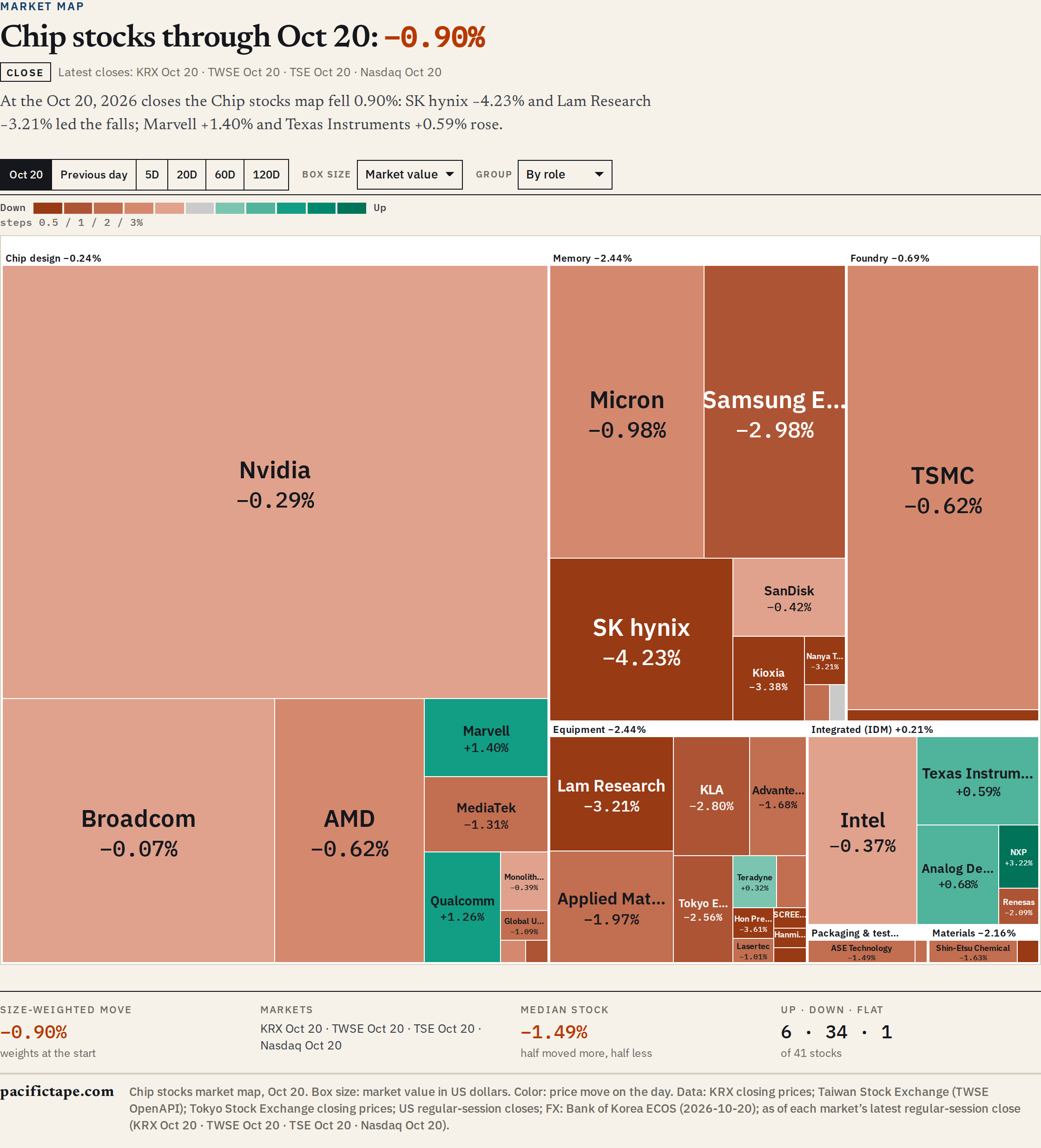
Read the sizes first, then the groups, then the colors. On October 20, 2026, the boxes added up to about US$15.98 trillion, and one of them, Nvidia, covered a third of the picture. The examples below all come from that day, when Seoul, Taipei, Tokyo and New York each traded a regular session dated October 20.
Which stocks are on the Chips map?
The members are picked by rule, not by hand. The starting list is every constituent of six global and regional semiconductor indexes, among them indexes of Asian, Japanese, Korean and memory-chip stocks. From that list we leave out:
- stocks listed in mainland China and Hong Kong;
- European listings such as ASML, because the map covers the markets around the Pacific;
- companies whose main business is not chips;
- anything below a market value of US$10 billion in Asia, or US$50 billion in the US.
That leaves 41 stocks, from Nvidia at about US$5.23 trillion to King Yuan Electronics (KYEC), a Taiwanese chip-testing company, at about US$10.25 billion. The biggest box is roughly 510 times the smallest.
Each company also carries one of seven roles in the chip supply chain: chip design, memory, foundry (contract chipmaking), equipment, integrated makers that design and build their own chips (IDM), packaging and test, and materials. We assign the roles ourselves, and they rarely change.
What do the box sizes mean?
A box’s area is the company’s market value: its shares times its latest closing price. Prices in won, New Taiwan dollars and yen are converted to US dollars at Bank of Korea (ECOS) exchange rates. On October 20 those were 1,328.1 won, 32.504 New Taiwan dollars and 158.55 yen per dollar.
Market value is not adjusted for free float, so a company’s share of the map is not its weight in any index.
On October 20:
- Nvidia was 32.7% of the map.
- Nvidia, TSMC and Broadcom together were 54.7%.
- Samsung Electronics and SK hynix together were 10.0%.
- By country, US-listed stocks were 70.6% of the map, Taiwan 15.2%, Korea 10.1% and Japan 4.1%.
That is why the Box size menu has three settings:
- Market value (the default): area in proportion to market value.
- Square root: area in proportion to the square root of market value. Big companies still get bigger boxes, but not in proportion. Nvidia drops from 32.7% of the map to 12.4%, and small companies such as Hanmi Semiconductor become readable.
- Within group: every group gets an area in proportion to its number of stocks, and only inside a group do boxes follow market value. Twelve equipment makers then take more room than two foundries.
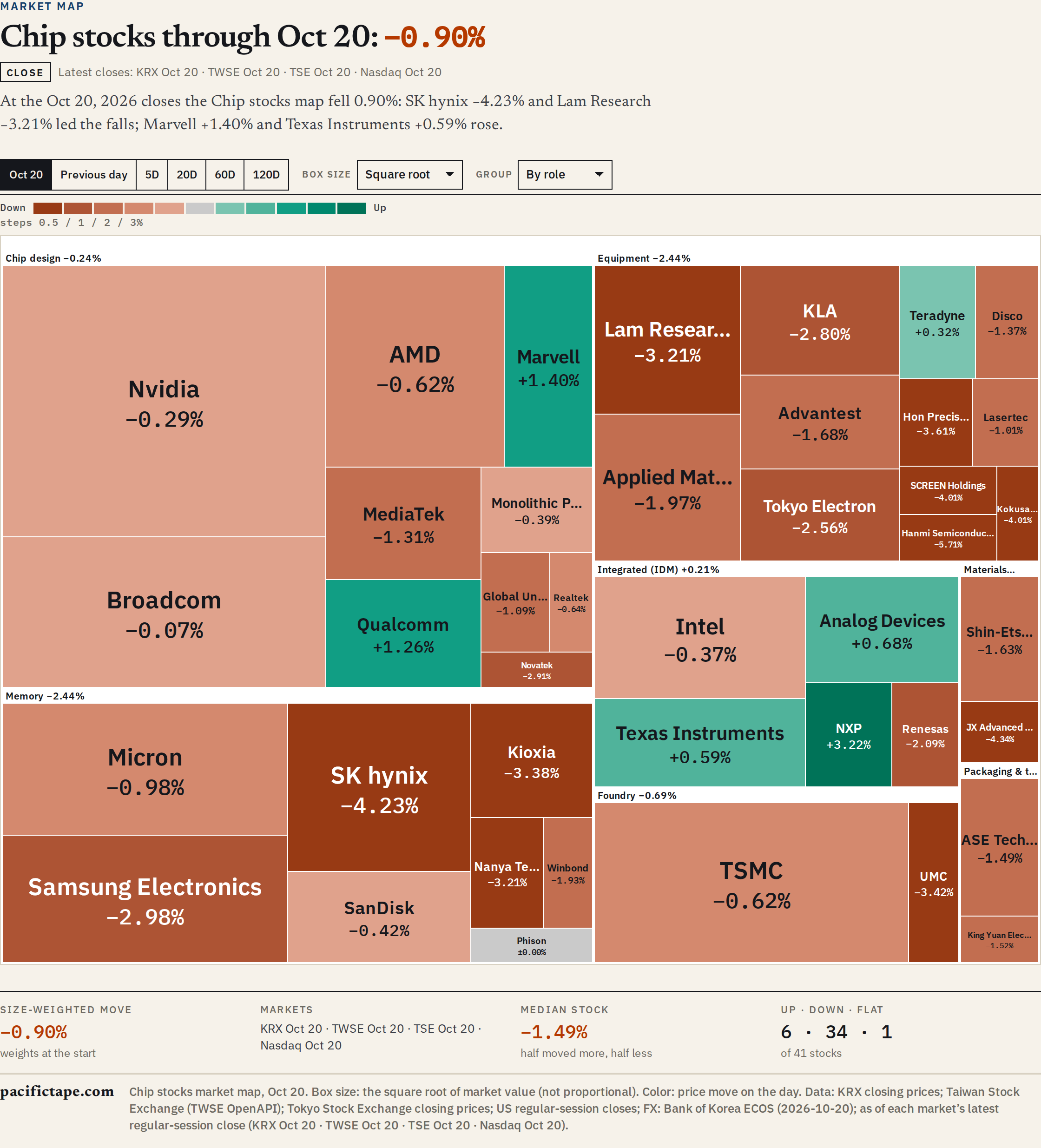
Only the default setting shows market value in proportion. With the other two, compare colors and labels, not areas.
What do the colors mean?
- Green is a rise, red is a fall and gray means unchanged.
- The color gets stronger in five steps. For one day the steps are a move of less than 0.5%, 0.5% to 1%, 1% to 2%, 2% to 3%, and 3% or more.
- Longer periods use wider steps, so a normal week does not paint the whole map in full color: 1/2/4/6% for 5 days, 2/5/10/15% for 20 days, 3/7/15/25% for 60 days and 5/10/20/35% for 120 days. The legend above the map shows the steps in use.
- Every figure carries a + or − sign, and the legend says Up and Down, so the map can be read without relying on color.
Past the last step every box has the same full color. On October 20 Hanmi Semiconductor fell 5.71% and Kioxia fell 3.38%, and both are the darkest red. For the exact number, read the label or tap the box.
A note on Asian sources: broker apps and news in Korea and Taiwan generally use the opposite colors, red for a rise. Whatever map you open, read the legend first.
How do you read the groups?
The Group menu sorts the boxes by role (the default) or by country. Each group’s label shows its own move, weighted by market value. Tap a group’s name to zoom in on it, and tap a box for its name, country, role, ticker, move, price in local currency and market value in dollars.
On October 20, by role:
- Chip design (10 stocks, 52.7% of the map) fell 0.24%.
- Memory (8 stocks, 19.0%) fell 2.44%.
- Foundry (2 stocks, 12.3%) fell 0.69%.
- Equipment (12 stocks, 8.4%) fell 2.44%.
- Integrated makers (IDM) (5 stocks, 6.4%) rose 0.21%.
- Packaging and test and materials (2 stocks each, 0.6% of the map each) fell 1.49% and 2.16%.
By country, US-listed stocks fell 0.42%, Taiwan 0.88%, Japan 2.38% and Korea 3.53%.
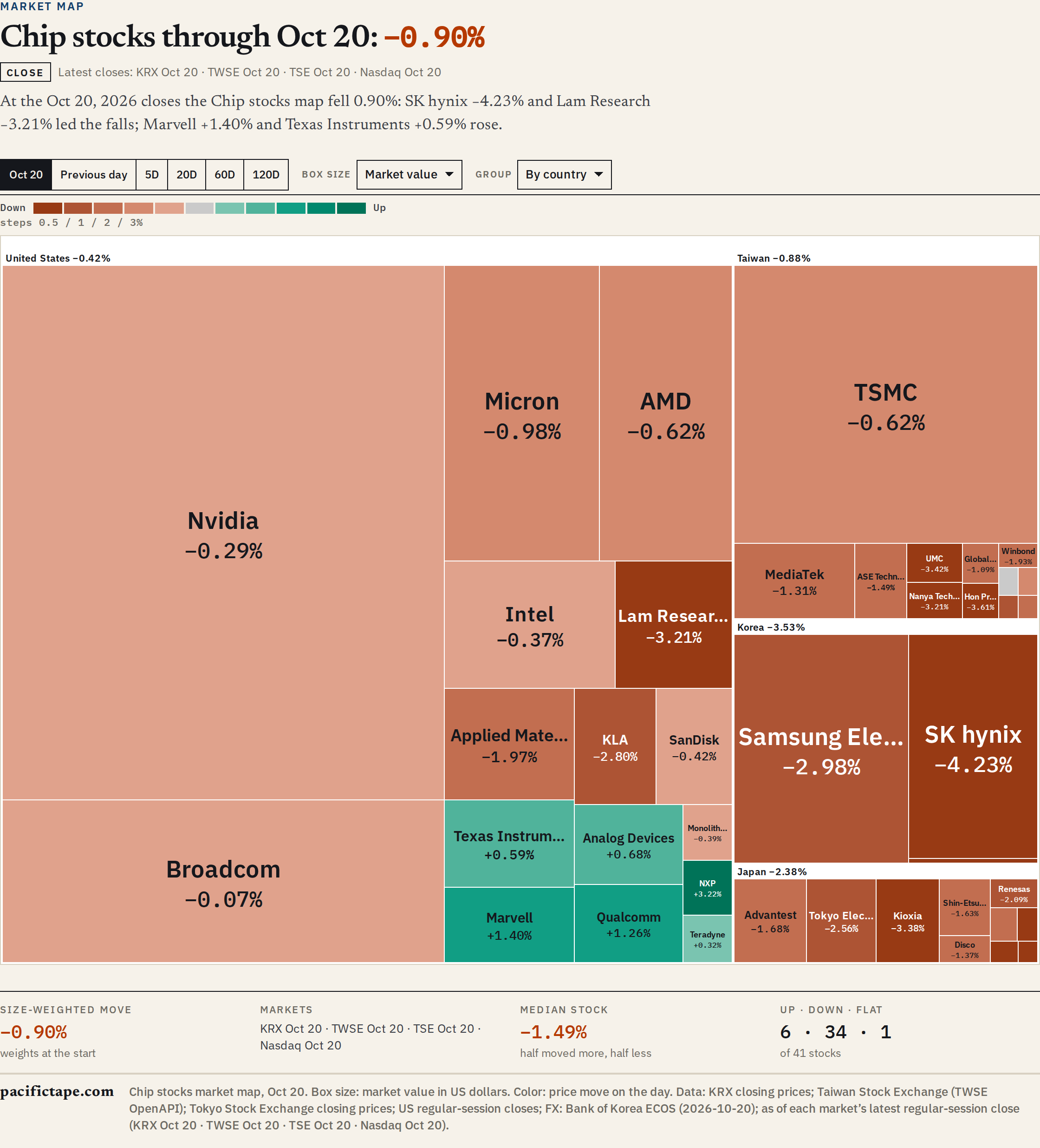
Read a group’s number together with how many boxes are behind it. Korea is three stocks, and two of them, Samsung Electronics and SK hynix, are almost all of its area.
Why can the headline number and the typical stock disagree?
Under the map, four numbers sum up the day. On October 20:
- Size-weighted move: −0.90%. Each stock’s move, weighted by its market value at the start of the period. This is the move of the whole basket.
- Markets: the date of the close each market contributes.
- Median stock: −1.49%. Half the stocks moved more than this, half less.
- Up · down · flat: 6 · 34 · 1. Six stocks rose, 34 fell and one was unchanged.
The basket fell less than the typical stock because the biggest boxes fell little: Nvidia −0.29%, Broadcom −0.07% and TSMC −0.62%. Leave Nvidia out and the other 40 stocks fell 1.19%, weighted the same way. The 25 Asian stocks fell 2.02% together.
A small box can still move the total more than a large one. SK hynix fell 4.23% and Samsung Electronics 2.98%, and each took about 0.18 percentage point off the map’s move, about twice the 0.09 point from Nvidia, which was more than three times their combined size.
The largest single moves that day were:
- Down: Hanmi Semiconductor −5.71%, JX Advanced Metals −4.34%, SK hynix −4.23%, Kokusai Electric −4.01%, SCREEN Holdings −4.01%
- Up: NXP +3.22%, Marvell +1.40%, Qualcomm +1.26%, Analog Devices +0.68%, Texas Instruments +0.59%
Which day is the map showing?
Each box uses its own market’s latest regular-session close. The line above the map names each market’s date, for example “Latest closes: KRX Oct 20 · TWSE Oct 20 · TSE Oct 20 · Nasdaq Oct 20”. Three things follow from that:
- The dates are local. Seoul, Tokyo and Taipei had closed on October 20 before New York opened its October 20 session. Our guide to the four closes sets out the order of the day.
- While a market is open its boxes show the latest trades, updated about every 15 minutes (Japan and Taiwan 20 minutes delayed), and the line says which markets are live. A closed market keeps its close.
- A Taiwan close is marked preliminary until the map has loaded the exchange’s official daily file.
The period buttons work the same way. Previous day is each market’s session before the latest one. 5D, 20D, 60D and 120D count that many sessions in each market, so a 20-day move in Tokyo and one in New York can start on different dates when their holidays differ.
What can the Chips map tell you, and what can’t it?
A one-day map is good at three things:
- Concentration: whether a move came from a few giants or from the whole group.
- Breadth: how many stocks rose and how many fell.
- Supply-chain pattern: whether memory, equipment or design moved apart from the rest, and whether one country moved apart from the others.
It cannot tell you:
- Why prices moved. The map has no news in it.
- How much was traded. A box looks the same on a quiet day and a busy one.
- What a US receipt did. The map uses each company’s home listing, so SK hynix is its Seoul shares, not SKHY. Our guide to Asian chip tickers in a US account covers the receipts.
- Whether a stock is cheap or expensive. A red box is a falling price, not a judgment about the company.
Where are the other maps?
The same controls work on four more maps:
- Memory: 12 stocks, the memory-chip companies plus four equipment makers that supply them: Hanmi Semiconductor, Advantest, Tokyo Electron and Disco. Our guide to who makes what in memory explains the roles.
- Japan and Taiwan: each country’s chip stocks, 22 and 20 of them.
- Korea: the whole KOSPI 200 and KOSDAQ 150, grouped by sector, explained in our KOSPI heatmap guide.
Sources
Related reading
More in Explainers
- Asia Chip Stocks From a US Account: SKHY, TSM, KXIAY and Other TickersExplainers
- Who Makes What in Memory: DRAM, NAND and HBM Across Asia and the USExplainers
- How to Buy Japanese Chip Stocks: Tokyo Shares, OTC ADRs and ETFsGuides
- How to Buy Taiwan Stocks From Abroad: TWSE Shares, TSM and ETFsGuides
- What Do 3nm and 2nm Mean? Chip Process Nodes ExplainedExplainers
- US Chip Export Controls on China, ExplainedExplainers
- What Is CoWoS? TSMC's Advanced Packaging and the AI Chip BottleneckExplainers
- Foundry, Fabless and IDM: How Chipmakers Split the WorkExplainers
- Why Samsung Reports Earnings Twice, and How Other Chipmakers ReportExplainers
- SOXX vs SMH vs SOXQ: How Three Semiconductor ETFs DifferExplainers
- How a Stock Gets Into the S&P 500 and the Nasdaq-100Explainers
- Dow, S&P 500 and Nasdaq: What Each US Stock Index MeasuresExplainers
- US Stock Futures Overnight: What Dow, S&P 500 and Nasdaq Futures ShowExplainers
- One Chip Day, Four Closes: Seoul, Taipei, Tokyo and New YorkExplainers
- Japan's Margin Trading Data: What It Says About KioxiaExplainers
- Kioxia Outside Japan: 285A in Tokyo vs KXIAY Over the CounterExplainers
- Kioxia's 3-for-1 Split: How to Read Its Price HistoryExplainers
- Micron's Fiscal Calendar: Why Its Quarters Don't Match Samsung'sExplainers
- Nikkei 225 vs TOPIX: Why Chip Stocks Move Them So DifferentlyExplainers
- The Philadelphia Semiconductor Index (SOX) and Why Asia Watches ItExplainers
- Taiwan's 10% Daily Price Limit and Other Rules for Foreign InvestorsExplainers
- TSM vs 2330: Why TSMC's US Shares Trade Above TaipeiExplainers
- TSMC's Monthly Sales: How Taiwan's Monthly Revenue Reports WorkExplainers
- Why One Stock Moves Taiwan's Market: TSMC and the TAIEXExplainers
- How Foreign Investors Move the KOSPI, and Where to See the Daily DataExplainers
- How to Buy Korean Stocks in 2026: 4 Routes for US, Singapore, UKGuides
- How to Buy Samsung Stock Outside Korea: Shares, London GDR and ETFsGuides
- Korea Discount and the Value-up Program, Explained SimplyExplainers
- KOSPI Heatmap Explained: How to Read Korea's Market MapMarket Map
- Why MSCI Still Hasn't Upgraded Korea, and What Would Change ItExplainers
- How Samsung and SK hynix Compare in HBMSamsung & SK hynix
- SKHY vs 000660: How the Two Ways to Own SK hynix DifferSamsung & SK hynix
- Why Is the KOSPI So Volatile? Chips, Foreign Money and the WonExplainers